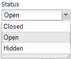
MODx.combo.ComboBox
Last updated Apr 30th, 2019 | Page history | Improve this page | Report an issue
Support the team building MODX with a monthly donation.
The budget raised through OpenCollective is transparent, including payouts, and any contributor can apply to be paid for their work on MODX.
Backers
Budget
$243 per month—let's make that $500!
Learn moreMODx.combo.ComboBox
Extends:Ext.form.ComboBox Key Features: Remote and local data stores; grid renderer.

The MODExt ComboBox class contains all of the functionality of a regular Ext ComboBox. It may be populated remotely by an array of JSON objects from a connector (default), or locally (using a basic Javascript array or an Ext ArrayStore, with the "mode" config option set to "local").
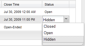
One unique feature of the MODx ComboBox class is the built-in renderer for grids. It allows developers to use a ComboBox as a grid editor, and automatically takes care of displaying the correct displayValue in the grid cell:

Unique Parameters
The unique parameters for the class are simply pass-thru parameters to the data store for the combo:
| Name | Description | Default |
|---|---|---|
| url | The URL to the connector. | |
| baseParams | Any other parameters to always send to the connector. | {} |
| fields | The fields, in array format, you expect from the connector response. | [] |
The class also inherits all Ext.form.ComboBox properties.
Using the Grid Renderer
MODx.combo.ComboBox also comes with a built-in renderer for usage in grids. To use in, in your grid's column model defintion, simply specify renderer: true in the editor definition, like so:
{
  header: _('usergroup')
  ,dataIndex: 'usergroup'
  ,width: 140
  ,editor: { xtype: 'modx-combo-usergroup' ,renderer: true}
}
An example of a local data combo box would be:
Units Combo Box
Doodles.combo.Units = function(config) {
    config = config || {};
    Ext.applyIf(config,{
        store: new Ext.data.ArrayStore({
            id: 0
            ,fields: ['unit','display']
            ,data: [
                ['MB','Megabyte']
                ,['GB','Gigabyte']
                ,['TB','Terabyte']
                ,['PB','Petabyte']
                ,['EB','Exabyte']
                ,['ZB','Zettabyte']
                ,['YB','Yottabyte']
            ]
        })
        ,mode: 'local'
        ,displayField: 'display'
        ,valueField: 'unit'
    });
    Doodles.combo.Units.superclass.constructor.call(this,config);
};
Ext.extend(Doodles.combo.Units,MODx.combo.ComboBox);
Ext.reg('doodle-combo-units',Doodles.combo.Units);
'store' is used to create your 'fields' and 'data', the optional 'mode' must be set to 'local' for this method.
And to view that combo box:
Combo Call From Grid
       {
            header: _('unit')
            ,dataIndex: 'unit'
            ,sortable: false
            ,width: 50
            ,editor: { xtype: 'doodle-combo-units', renderer: true }
        }
Combo Call From Window
       {
            xtype: 'doodle-combo-units'
            ,fieldLabel: _('unit')
            ,name: 'unit'
            ,hiddenName: 'unit'
            ,anchor: '100%'
        }
hiddenName must be set when calling from a create or update window to save the value, but is not needed in the grid view.
Support the team building MODX with a monthly donation.
The budget raised through OpenCollective is transparent, including payouts, and any contributor can apply to be paid for their work on MODX.
Backers
Budget
$243 per month—let's make that $500!
Learn more


